How to create content for your LED wall
- Refresh LED
- Hits: 5822
Creating content for your LED wall is very different than any other type of source. When it comes to LED content…
your displays should:
- Be creative and visually appealing
- Clearly communicate your message
- Utilize a strategy to guide your audience through your processes
- Follow best practices for video and graphic content
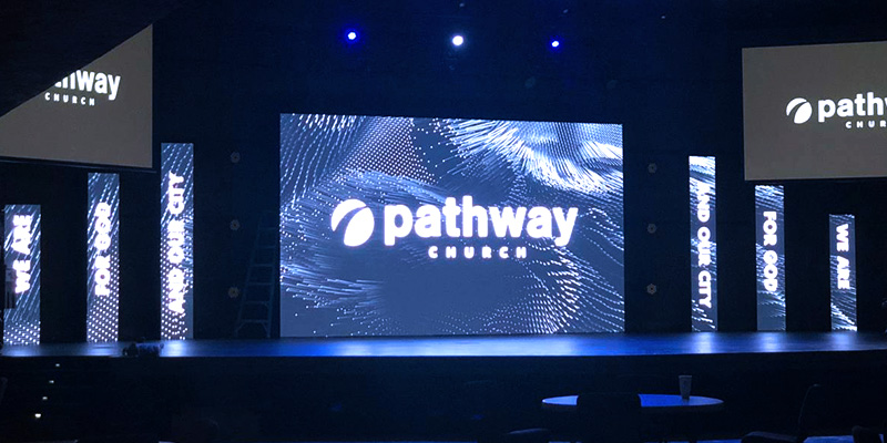
Because this content is so large, the video wall demands attention and easily captures the eyes of those around it. However, content that isn’t catered to your LED wall can quickly miss the mark and lose its impact. Try some of these tips for LED video wall content creation in your organization and see what beautiful and engaging designs you can develop!
Know Your Aspect Ratio Right
Remembering your LED product’s aspect ratio and how that influences the items you display is one of the most important principles to understand when designing content. Design your LED graphics and media with the ratio at the forefront of your mind, and don’t change it. Creating outside the ratio will lead to distorted images that don’t look right.
Consider The Viewing Distance
Your LED screen’s viewing distance helps determine how big and bold you should make the content you’re designing so that it can easily be read by all viewers. A good rule of thumb to follow is the lower the screen resolution and the viewing distance, the larger and bolder you should make the graphics. Larger outdoor video walls, such as billboards, should have larger graphics so that those who are further distances can still read them. With higher-resolution indoor LED screens, you can use smaller graphics since the viewing distance is shorter in many cases.
Use Motion Graphics
Has a motion graphic or video ever caught the corner of your eye? If one has, you know the feeling. Viewers tend to do a double-take because the motion graphic is enough to draw them in. In general, you should try to use motion graphics instead of static ones when possible. Moving images like videos and motion graphics will get more attention than a static image or plain text every time and create more engagement with your audience.
The Three S’s: Short, Sweet, and Simple
Much like we learned in grade school at a young age, you don’t want to load down a slide with too much information or text to read. Too much text can become confusing and hard for viewers to know where to focus. Show them what you want them to see and eliminate any other distractions.
- Use minimal wording in big, bold letters
- Add interesting images
- Make your messaging concise
Utilize Contrast and Consider Visibility
To avoid washed-out text, images, and graphics, try to capitalize on high-contrast designs. This will make your items really pop off the screen and are much easier for all viewers to read. The contrast doesn’t have to literally be black and white, but you will want to proof and test all graphic colors before committing to them on the big screen. Stick to basic design principles.
Try Our Free Motion Graphics
Looking for even more ideas and resources to help get you started? Refresh LED created a free motion graphics package for organizations just like yours! Download yours here today and connect with our team for any other questions you have.


